Radio Button List
A Check box list renders a list of options and allows user to select one value. It is identical in function to a drop down. The selected value is passed through to a script as part of an event.
Add a Radio Button List
Properties
Direction
TopToBottom or LeftToRight - How the options should display to the userOptions
Specify a list of options to display in the control. It can be generated from a static list or from data. When populating the Options from a connector or file, use the Field Mapping Editor found in the Property Grid (seen circled in red below) to assign the Text and the Value of the items.

Read-Only
Set to True if you want the control to display as read-only (value can't be changed) on the page.Selected Value
The option selected when the page loads. The Selected Value must map to one of the Options Values (not Text) in order to work. This option is saved if the user doesn't change itValidations
Some Validators that can be applied to the RadioButtonListVisible
Set to False if you don't want this control to render on the page and be visible to the user. In the near future, you will be able to use a script to make it visible when an event occurs.
Assigning data to a RadioButtonList
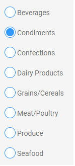
Example:
To display a RadioButtonList containing option values retrieved by a SQL query:
- Use an appropriate Event, e.g. Load (page) or Click (button) to which a SetValue action can be added.
- Add a SetValue action that populates the RadioButtonList options with each returned value.
Retrieving data from a RadioButtonList
Properties that can contain data:
- Options (Value)
Use an action to capture the values from the control. Go here for more details on how to collect data from controls.
Events
Change
An event that triggers when another option in the dropdown is selected.Event Input Parameters:
- PreviousOption
The Text and Value of the option that was selected before selecting the option. - SelectedOption
The Text and Value of the newly selected option.
- PreviousOption