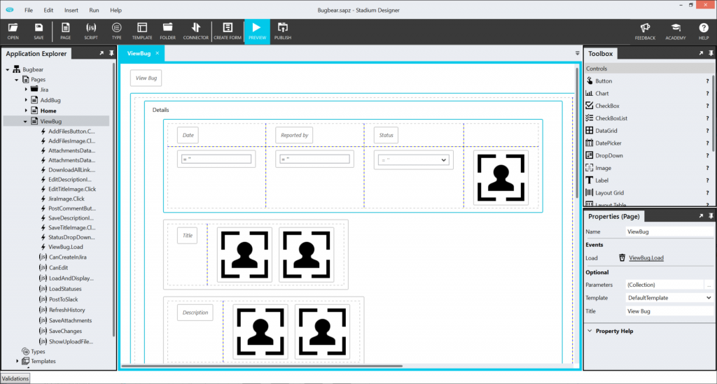
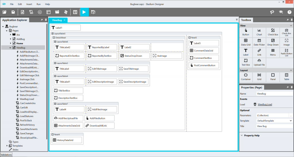
The page canvas in the Designer is all about the control layout on your page and not so much about the visual accurateness of those controls. We have taken this a step further by abstracting the controls even more and removing all unnecessary white space between them as much as possible. The result is a better overview of your page and the layout thereof. The before and after screenshots below clearly show the improvement.


Previously, as seen in ‘before’, the canvas tried to accurately represent the controls during design time – or that is what it seemed like for most users. But in actual fact, controls were not supposed to mimic the run-time representation but rather simply indicate where the control would be positioned on the page. This misrepresentation confused a lot of users expecting to see a change on the canvas when control properties were changed.
Another issue caused by the misrepresentation was the wasted whitespace on the canvas, distracting the user from the canvas’ actual purpose: page layout. Most of that whitespace was due to how the controls were displayed on the canvas. To understand this, one first needs to understand the framework of a Stadium page. A page could be seen as being divided into many horizontal swimlanes, one below the other. Every swimlane can contain controls side by side, but not above or below each other. This meant when a Label was positioned next to an Image control, a large area of whitespace below the Label control was unusable and therefore “wasted space” (see image below).

All of the above considerations led us to what we call the “Blocky Layout”. In the latest canvas, all controls are represented by equally sized blocks containing the control name and the icon differentiating the type of control. These blocks are abstract enough to not mislead anyone into thinking it is the control’s real representation. It also allows for a much neater and minimalistic canvas with almost no wasted space, leaving you to focus on what the canvas was originally intended for – laying out the controls on your page.
Please let us know what your impression is of our Blocky Layout!
